Hello everyone! I’m Igarashi, the producer of Brigandine: The Legend of Runersia.
This is a continuation of the monster design discussion, courtesy of our art director, Mr. Jin Tamura.
********************************************
I’ll continue by talking about the work that goes into developing the game’s monster designs.
■ Facial expressions of humanoid monsters
The facial expressions of humanoid monsters (especially female monsters) was a headache during illustration.
Games with heavy themes tend to hide their faces or make them more creature-like to erase their individuality.
There are many reasons this design principle is adopted.
・ Fear of lessening the impact of what should be terrifying monsters, making them frivolous.
・ To clearly differentiate between characters with stories and those without.
These are just a couple of reasons.
Up to a certain point, we did follow this approach for the game’s designs. For example:
・ Making their facial expressions hard to see by darkening the area around their eyes.
・ Adding a harsh glint to their eyes, or reversing the black and white parts for an inhuman feel.
We tried these and various other methods.
However, as time went on, something just seemed to be lacking, so we had to keep making minute adjustments.
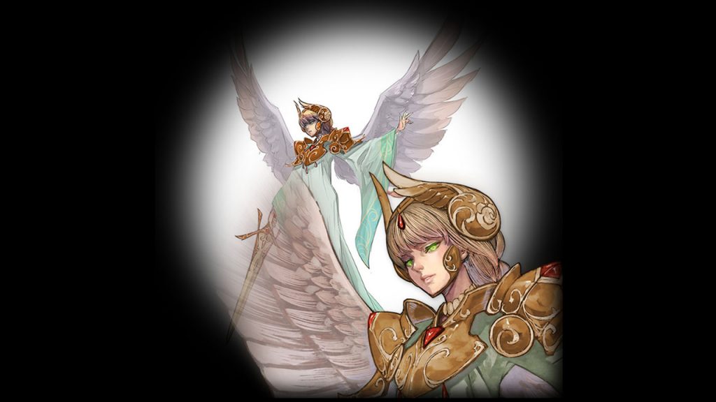
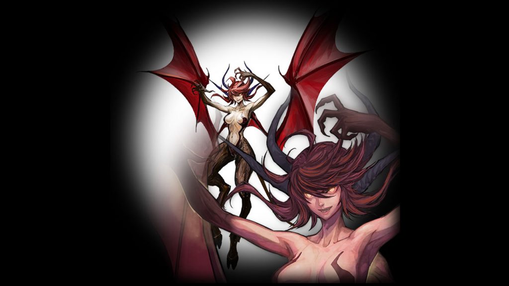
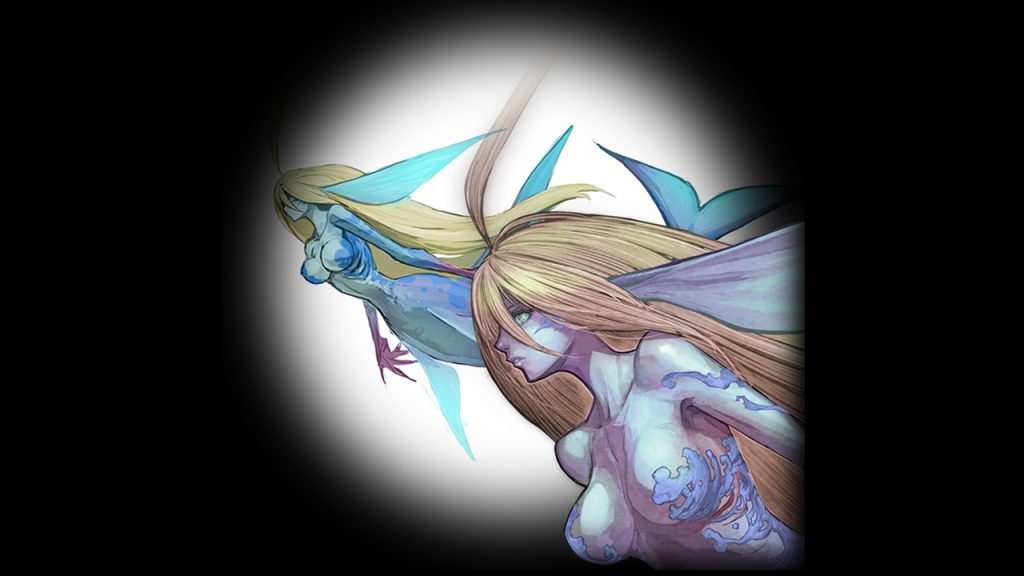
As you can see, we finally settled on humanoid units who will completely blend in with the human knights.
・ Angel

・ Demon

・ Mermaid

In other words, we decided to depict this game’s monsters
in a way that makes players feel they are as important as the human knights with which they fight alongside.
In the game, you can give monsters personal names as well. The goal is to hopefully make you
feel affection for these allies that have gone through thick and thin together with you.
Nothing could make me happier than to know these ladies have become memorable characters to you!
■ Angel and Demon
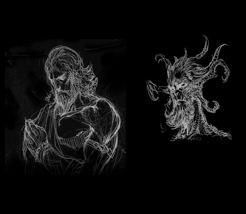
Side point: We actually had male versions of angels and demons too! Initially, they were promising candidates,
but sadly lost out in a side-by-side comparison research on gender and age patterns.
Here are a couple of sketches for you to enjoy anyway!

That’s all from me on the topic of monster design.
As always, thank you for reading!

